Goals and Background
The goal of this laboratory exercise is to help equip the analysts with the skills to extract surface temperature information through the analysis of thermal bands in satellite images. This also takes into consideration the variations in land surface temperature over space. More specifically this lab introduces analysts to the ways of spectral emittance collected by satellites and build models in order to estimate the surface temperature from the thermal bands.
Methods
In this lab we will be using ERDAS Imagine 2013 to learn more about thermal remote sensing. We will also be running models to compensate for errors in the images due to various atmospheric distortion.
Visual Identification of Relative Variations in Land Surface Temperature
Comparing low grain and high grain bands can produce information of the same area with just some slight variation in radiometric qualities. First, it is important to compare these different bands (such as band 61 and 62). While there may not be drastic differences it is important to compare the data between these bands.
Conversion of Digital Numbers to At-Satellite Radiance
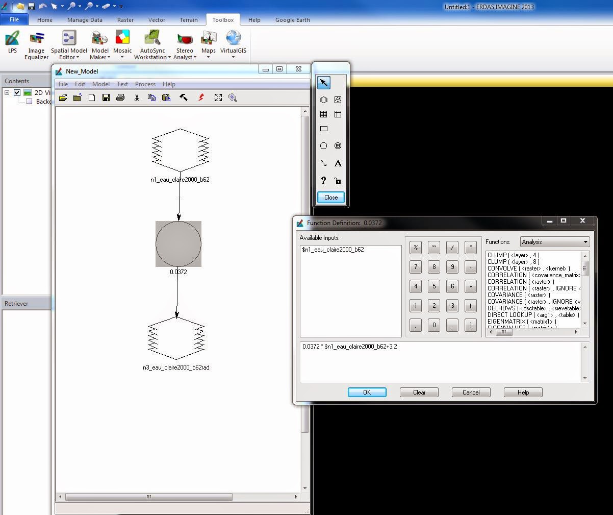
The conversion of DN (digital numbers) to at-sensor spectral radiance is calculated by the following equation: L(lambda)= Grescale * DN + Brescale. The Grescale can be calculated by the following formula: Grescale = (LMAX-LMIN)/(QCALMAX-QCALMIN). The numbers used in these calculations can be found in the metadata of the images. By opening the information in WordPad, the analyst is able to read through the data and select the necessary information to complete the conversion (Fig 1).

The purpose of the equations is to create a new image which is required on for the calculation of land surface temperatures from ETM+ image. Once the formulas have been completed they can be inserted into a model in ERDAS Imagine 2013. In ERDAS, the first step is to open model maker. Then input the image, band 62 into the model and insert the formula for calculating L(lambda) (Fig. 2). Once the model is run, the new image is produced.


Methods
In this lab we will be using ERDAS Imagine 2013 to learn more about thermal remote sensing. We will also be running models to compensate for errors in the images due to various atmospheric distortion.
Visual Identification of Relative Variations in Land Surface Temperature
Comparing low grain and high grain bands can produce information of the same area with just some slight variation in radiometric qualities. First, it is important to compare these different bands (such as band 61 and 62). While there may not be drastic differences it is important to compare the data between these bands.
Conversion of Digital Numbers to At-Satellite Radiance
The conversion of DN (digital numbers) to at-sensor spectral radiance is calculated by the following equation: L(lambda)= Grescale * DN + Brescale. The Grescale can be calculated by the following formula: Grescale = (LMAX-LMIN)/(QCALMAX-QCALMIN). The numbers used in these calculations can be found in the metadata of the images. By opening the information in WordPad, the analyst is able to read through the data and select the necessary information to complete the conversion (Fig 1).
(Fig. 1) This image shows the metadata in WordPad which provides the necessary information used to convert DN to at-satellite radiance.
The purpose of the equations is to create a new image which is required on for the calculation of land surface temperatures from ETM+ image. Once the formulas have been completed they can be inserted into a model in ERDAS Imagine 2013. In ERDAS, the first step is to open model maker. Then input the image, band 62 into the model and insert the formula for calculating L(lambda) (Fig. 2). Once the model is run, the new image is produced.
(Fig. 2) This image shows model maker and the elements used to produce the final output image in this step to convert the DN to an at-satellite radiance image.
Conversion of At-Satellite Radiance to Blackbody Surface Temperature
In order to gain the land surface temperatures from the thermal band of satellite images a certain formula must be applied to the radiance image. Since the temperature on land will be different from the true, or kinetic, temperatures collected by the satellite image this conversion is required to gain accurate data. The following formula is used to convert at-satellite radiance images to surface temperature: Tb= (K2/ln((k1/L(lambda))+1)). In this equation, K1 and K2 are the ETM+ and TM thermal band calibration constants which depend on the Landsat satellite types.
To complete this conversion, another model must be run via the model maker in ERDAS Imagine. Once the model has been run with this new equation, the output image (Fig. 3) can be opened in ArcMap to analyze the results. In ArcMap, the identification tool can be used to find the surface temperature of various surface features on the map.
(Fig. 3) The following image is the output image produced after the model maker is run for the conversion of at-satellite radiance to blackbody surface temperature.
(Fig. 4) The output image from Fig. 3 being opened in ArcMap shows the different features in the image. The lighter the color in the image the cooler the temperature.
Calculation of Land Surface Temperature from TM Image
This calculation uses the formulas from the above sections by simultaneously converting the thermal band of the Landsat TM image to a surface temperature and at-satellite radiance. To do this, a model must be run which combines both the formulas (Fig. 5). To do so the input image is band 6 and the first formula is used to convert the Landsat TM image to an at-satellite radiance. Then the output image is set as a temporary raster image. Next, the formula which converts the at-satellite image to a surface temperature. Like in the previous step, the final output image can be opened in ArcMap and the surface temperatures can be analyzed.
(Fig. 5) This image shows the model maker used to produce a surface temperature image which can be used to analyze surface features.
Results
After completing this lab, the image analyst will have the skills to extract land surface temperatures from satellite images through the thermal bands. However, in order to do so the analyst must be knowledgeable about how to account for variations in land surface temperatures over space, something this lab has taught the analyst.
Sources
The data used throughout this lab exercise was collected from the following sources: Landsat satellite image is from Earth Resources Observation and Science Center, United States Geological Survey. The area of interest file was derived from ESRI counties vector features. All data was provided by Dr. Cyril Wilson of the University of Wisconsin- Eau Claire.


