Tuesday, October 7, 2014

Lab 4: Unsupervised Classification

Goals

The goal of this lab is to help the image analyst to extract information of both biophysical and sociocultural features in remotely sensed images. In order to do so, the use of unsupervised classification algorithms will help to gain this information. The two main objectives of this laboratory exercise are to execute unsupervised classification by inputting the correct requirements for such an algorithm as well as the ability to recode spectral clusters into useful information on land use and land cover.

Methods

Experimenting with Unsupervised ISODATA Classification Algorithm
This process uses ISODATA, iterative self-organizing data analysis technique algorithm to produce an image covering both the Eau Claire and Chippewa Counties.

The first step in this process is to set up an unsupervised classification algorithm. Once the original image is opened in ERDAS Imagine 2013 and select the unsupervised classification tool under the raster toolbar. We will use our original image as the input file and we will change the number of classes to 10-to-10. This means that the algorithm will classify the brightness values within the image into a total of 10 different categories. Next, the maximum number of iterations to 250. This means that the algorithm will run up to a total of 250 times in order to make sure it does not group unlike features together (Fig. 1).Once this is complete run the model and compare the input and the output images (Fig. 2).


(Fig. 1) This image shows the input image as well as the Unsupervised Classification window that is being used to classify the data in the original image. The adjustments to the formula have been seen as described above.


(Fig. 2) The input image can be seen on the left while the output image is on the right. The output image has undergone an unsupervised classification algorithm. 

The next step of the process is to recode the clusters produced by the unsupervised classification algorithm into meaningful classes which will show land use/land cover of Eau Claire county. To do so, we will be opening the image attributes. Next we will recode the classes. The best way to do this is to select each cluster individually and change the color to a bright yellow so it stands out (Fig. 3). Then we will decide which category it belongs to and re-color it. The class names and colors we will be using area as follows: Water-Blue, Forest-Dark Green, Agriculture-Pink, Urban/built-up-Red and Bare soil-Sienna.


(Fig.3) This image displays the image which had previously undergone the unsupervised classification and has been recoded according to the class names and colors as described above.

Improving the Accuracy of Unsupervised Classification

One of the main problems that arose from the first classification process is that it was difficult to identify the differences between the forest and agriculture land use/land cover classes. Since this is the case, it is not clear which classes are correct and which are incorrectly classified. For this reason, we will be running the same process as we did above, however, we will be changing the minimum and maximum number of classes to 20-to-20 as opposed to the 10-to-10 we did in the above section. This should help to make a more accurate map when it comes to classifying the unsupervised clusters. The same process is repeated, the algorithm is run and the analyst recodes the image in order to select the appropriate classes for the clusters. Once this is complete we can compare the output image from the previous section and the new output image to see if changing the number of classes had an effect on the map and classifications (Fig. 4).


(Fig. 4) The first output image can be seen on the right which used 10-to-10 classes to perform the classification process and on the left is the image produced after using the 20-to-20 classification.

As can be seen in the comparison of the two images in Fig. 4, by increasing the number of classes in the unsupervised classification algorithm the classification of various LULC (land use/land cover) classes can be more accurately determined. The original output image was challenging to classify because the 10 clusters which the algorithm produced grouped much of the agriculture and forest land together. This lead to the image being dominated by agriculture (represented by the color pink) which is not the correct distribution of land in Eau Claire County. After more classes were added it was easier to accurately identify LULC classes because the clusters were more accurate. 

Another way that we can further organize the classes is to change the column properties in the raster attributes. This will allow us to chose which order we want the columns to be displayed in when we view the attributes of the data. 

Then we will recode the LULC classes in order to make it easier to generate maps using this data. To do so we will select the thematic tab under raster and select the recode tool. The next step is to change new values so that all the like LULC classes are grouped together. For example, the map has a number of classes which were classified as agriculture but rather than having multiple classes for the same LULC we will change the values for all the agriculture to be 3. (Water will be 1, forest will be 2, urban/built-up will be 4 and bare soil will be 5). This way when we go to create a professional looking map using this data it will be much easier. In the last step we will use ArcMap to produce a map which presents the classification data in a more understandable manner for viewers (Fig. 5).


(Fig. 5) The image above shows how the classification work done in ERDAS Imagine can be used to create a visually pleasing map which is easier to interpret by the viewer. 

Results

As a result of completing this laboratory exercise the image analyst learned a number of important techniques for classifying remotely sensed data, particularly for land use/land cover. Unsupervised classification was used to produce all the above images, however to better understand how the algorithms used in this process work we made changes to see how it effects the images and therefore the classification. In the first portion of the lab, we used 10-to-10 classes in the algorithm and tried to classify the LULC (land use/land cover) classes from there, however, it was difficult. After completing the second portion of the lab exercise where we used 20-to-20 classes in the algorithm we gained more insight into how the number of classes can affect the overall accuracy of the classification of the image. In the end we learned that the greater the number of classes used in the unsupervised classification algorithm the easier to identify LULC classess. 

Sources

Data for this lab was collected from: United States Geological Survey and Earth Research Observation Science Center.

Thursday, October 2, 2014

Lab 3: Radiometric and Atmospheric Correction

Goals and Background

The main goal of this lab is to practice atmospherically correcting remotely sensed images. Throughout this lab the image analyst will further develop their skills in atmospheric correction using multiple methods. These methods include: absolute atmospheric correcting using empirical line calibration, absolute atmospheric correction using enhanced image based dark object subtraction, and relative atmospheric correction using multidate image normalization.

Methods

Absolute Atmospheric Correcting: Using ELC (Empirical Line Calibration)

Throughout this part of the lab we will be using the ELC method which matches in situ data to the remotely sensed data which is collected at the same time the aerial image is taken over the area of interest. ELC can be calculated by the following equation: CRk = DNk * Mk + Lk where CRk is the corrected digital output pixel values for a band, DNk is the band which should be corrected, Mk which is a multiplicative term which affects the brightness values and Lk is an additive term. 

The Mk value acts as the gain and the Lk acts as the offset  which are used to create the regression equations used between the spectral reflectance measurement of the in situ data and the spectral reflectance measurement of the sensor for the same area.

In order to perform this type of atmospheric correction, we will use the Spectral Analysis Work Station in ERDAS Imagine 2013. The first step is to then open an analysis image, which is the image you want to correct. Once it has been added, then the next step is to click on the "edit atmospheric correction" option and select empirical line as the method (Fig. 1).


(Fig. 1) The atmospheric adjustment tool in the spectral analysis workstation is used to conduct the ELC atmospheric correction.

Once this window is open it is time to begin collecting samples and identify references from various spectral libraries in order to conduct the ELC. To do this we will first start by taking a sample of a road. We need to find a road surface feature in our image, select the color grey and then use the "create a point selector" tool it carefully select the middle of a road feature. This will add a line to the graph in the bottom right corner of the atmospheric adjustment tool window. The next task is to add the in situ spectral reflectance signature of an asphalt surface from the ASTER spectral library. Once this has been added you can see the difference between the signature of the image you are correcting compared to the spectral signature for that particular surface feature type (Fig. 2).


(Fig. 2) This image shows the spectrum plot for asphalt. The sample is from a road on our original image while the reference is from the ASTER spectral library. 

We will then continue this process for surface features including: vegetation/ forest, aluminum rooftop, and water. Now we will execute the ELC atmospheric correction. The spectral analysis workstation has created the regression equations for each of the bands in the image. After saving the regression information, we will then go back to the spectral analysis workstation to select the preprocess and atmospheric adjustment. After this has been run you will end up with the final output image which has been atmospherically corrected using the empirical line calibration method (Fig. 3). 


(Fig. 3) The original image has been atmospherically corrected using the ELC (empirical line calibration) method.

Absolute Atmospheric Correcting: Using Enhanced Image Based Dark Object Subtraction

The next method of atmospheric correction we will be using is the DOS (dark object subtraction) method. This process employees a number of parameters to atmospherically correct an image including: sensor gain, offset, solar zenith angle, atmospheric scattering, solar irradiance, absorption and path radiance. To execute this method requires two steps, first is the conversion of the image taken by the satellite to an at-satellite spectral radiance image. Second is the conversion of the at-satellite image to the true surface reflectance.

Step 1:
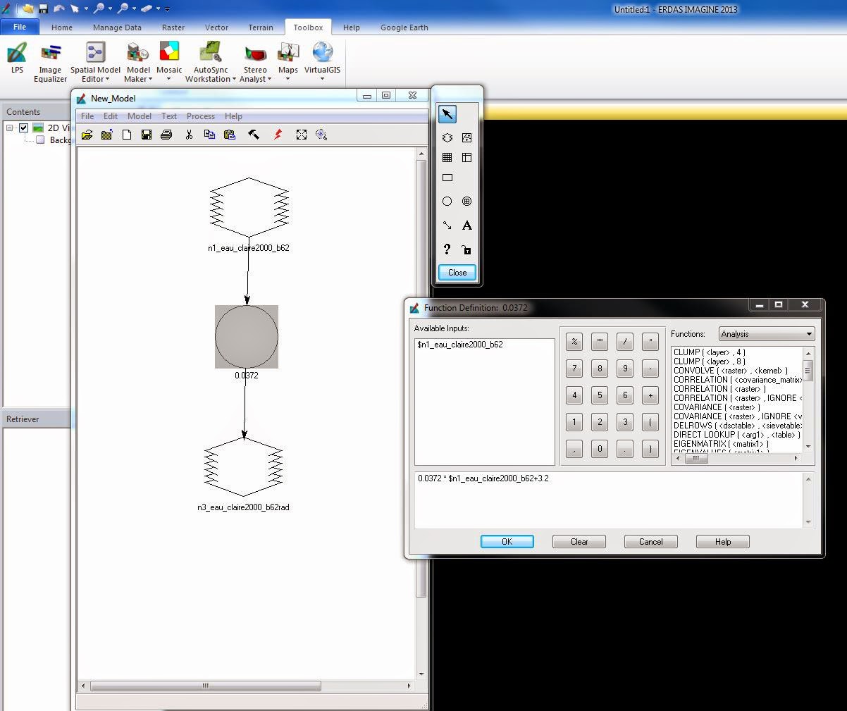
For step one we will first open model maker in ERDAS Imagine 2013. We will create 6 independent models in the same model maker window to save time. The input raster image will be each individual band from the original image we are wanting to atmospherically correct. The formula will be created using the formula seen in Fig. 4. Much of the data can be found in the overall image metadata. Once the formula is added to the model maker and the output images are saved in the correct place, the model can be run (Fig. 5). 


(Fig. 4) The formula used to convert he original satellite image to an at-satellite spectral radiance image. (Formula provided by Dr. Cyril Wilson of the University of Wisconsin- Eau Claire).


(Fig.5) The model maker module for the first step of the DOS method should include individual models for each of the 6 bands using the individual data found in the band metadata in the formula from Fig. 4.

Step 2:
Step two is basically the same process as used in step 1 however the formula is different. The formula (Fig. 6) includes measuring path radiance which is the distance between the origin of the histogram to the start of the actual histogram. This formula also uses the solar zenith angle which is a constant value for all the bands and the distance between the sun and Earth. This distance depends on the day of the year and can be found in a chart which lists these values. The next step is then to set up another model maker window with 6 individual models the same way we did in step 1 only using the new formula shown in Fig. 6. The new model will convert the at-satellite spectral reflectance to the true surface reflectance (Fig. 7).


(Fig. 6) This formula is used in the second step of the DOS method of atmospheric correction which will convert at-satellite spectral radiance to the true surface reflectance values.


(Fig. 7) The model maker module for the second step of the DOS method should include individual models for each of the 6 bands using the individual data found in the band metadata in the formula from Fig. 6.

Final Step:
After both of the above steps have been completed it is time to stack the 6 images produced from the second step. Once they have been stacked you can see the final output image compared to the original (Fig. 8). 


(Fig. 8) The image above shows the original image on the left and the atmospherically corrected image on the right using the DOS method.

Relative Atmospheric Correction: Using Multidate Image Normalization

The last method we will be using for atmospheric correction in this lab is multidate image normalization. This is usually something a method used when absolute atmospheric correction is not possible due to a lack of in situ data or metadata for a remotely sensed image. To perform this type of atmospheric correction we will need to have both the Chicago 2000 image and the Chicago 2009 image open at the same time in ERDAS Imagine 2013. First we will link and synchronize the images to find various surface features. Once we find the first point, a rooftop at O'Hare International Airport, we will open the spectral profile tool under he multispectral option. Making sure to unlink and unsync the two images before creating a profile point in the same place in each image we will collect the first spectral profile for each of the images. This means each image will need its own spectral profile. We will continue to collect more profile points throughout various surface features on the map. It is important that the points are taken at the same place in both of the images. For this lab we will be taking at total of 15 spectral signature points: 5 in Lake Michigan, 5 sin urban/built-up areas, and 4 four internal lakes (including the original point taken at the O'Hare Airport). After all the points have been taken the final spectral profiles should have all the point data on the individual graph for the Chicago 2000 and Chicago 2009 image (Fig. 9).


(Fig. 9) Once all the spectral signatures have been collected from both of the images they will have spectral profiles which contain all 15 points for each of the images. 

The next step is to click on the tabular data view in the spectral profile window. This data shows the actual pixel data of the samples collected from the images. To organize this data we will create a chart in Microsoft Excel that contains 15 rows (for the 15 samples collected) and 6 columns (for each of the six bands that make up each image). We will be making two separate charts, one for the Chicago 2000 image tabular data and the other for the Chicago 2009 image tabular data (Fig. 10). These charts will contain the means found in each band. Next, we will create a scatter plot graph for each band which includes both the mean values for both the 2000 image and the 2009 image. (A total of 6 graphs will be produced.) For each of the graphs add a regression line. The slope data represents the gain and the y intercept represents the bias. This data will then be used in the formula used to correct the image via the normalization method (Fig. 10). The next step is to open model maker once again and create 6 models in the same window as has been done earlier in the lab. Each band of the Chicago 2009 image will act as a separate input image and the formula from Fig. 10 will be used with the respective data for each band (Fig. 11). After the model maker has been run the next step is to stack the layers to produce the final output image. Once this is done you can compare the original Chicago 2000 image to the atmospherically corrected image (Fig. 12).


(Fig. 10) This is the formula used when conducting relative atmospheric correction using the multidate image normalization method.


(Fig. 11) The model maker used for the multidate image normalization method uses each of the individual bands from the Chicago 2009 image and the formula from Fig. 10 to produce the output image.


(Fig. 12) The original image can be seen on the right while the atmospherically corrected image (using the multidate image normalization method) can be seen on the right.

Results
After completing this lab, the image analyst will have the skills to perform both absolute and relative atmospheric correction. These methods include empirical line calibration, enhanced image based dark object subtraction and multidate image normalization. These various methods have their own strengths and weaknesses however, the analyst now has the knowledge to apply these correction methods to remotely sensed data of all kinds.

Sources
The data used throughout this lab exercise was collected from the following sources: Landsat satellite image is from Earth Resources Observation and Science Center, United States Geological Survey. All data was provided by Dr. Cyril Wilson of the University of Wisconsin- Eau Claire. 

Wednesday, September 17, 2014

Lab 2: Surface Temperature Extraction from Thermal Remote Sensing Data

Goals and Background

The goal of this laboratory exercise is to help equip the analysts with the skills to extract surface temperature information through the analysis of thermal bands in satellite images. This also takes into consideration the variations in land surface temperature over space. More specifically this lab introduces analysts to the ways of spectral emittance collected by satellites and build models in order to estimate the surface temperature from the thermal bands.

Methods

In this lab we will be using ERDAS Imagine 2013 to learn more about thermal remote sensing. We will also be running models to compensate for errors in the images due to various atmospheric distortion.


Visual Identification of Relative Variations in Land Surface Temperature
Comparing low grain and high grain bands can produce information of the same area with just some slight variation in radiometric qualities. First, it is important to compare these different bands (such as band 61 and 62). While there may not be drastic differences it is important to compare the data between these bands.

Conversion of Digital Numbers to At-Satellite Radiance
The conversion of DN (digital numbers) to at-sensor spectral radiance is calculated by the following equation: L(lambda)= Grescale * DN + Brescale. The Grescale can be calculated by the following formula: Grescale = (LMAX-LMIN)/(QCALMAX-QCALMIN). The numbers used in these calculations can be found in the metadata of the images. By opening the information in WordPad, the analyst is able to read through the data and select the necessary information to complete the conversion (Fig 1). 


(Fig. 1) This image shows the metadata in WordPad which provides the necessary information used to convert DN to at-satellite radiance.

The purpose of the equations is to create a new image which is required on for the calculation of land surface temperatures from ETM+ image. Once the formulas have been completed they can be inserted into a model in ERDAS Imagine 2013. In ERDAS, the first step is to open model maker. Then input the image, band 62  into the model and insert the formula for calculating L(lambda) (Fig. 2). Once the model is run, the new image is produced.


(Fig. 2) This image shows model maker and the elements used to produce the final output image in this step to convert the DN to an at-satellite radiance image. 

Conversion of At-Satellite Radiance to Blackbody Surface Temperature
In order to gain the land surface temperatures from the thermal band of satellite images a certain formula must be applied to the radiance image. Since the temperature on land will be different from the true, or kinetic, temperatures collected by the satellite image this conversion is required to gain accurate data. The following formula is used to convert at-satellite radiance images to surface temperature: Tb= (K2/ln((k1/L(lambda))+1)). In this equation, K1 and K2 are the ETM+ and TM thermal band calibration constants which depend on the Landsat satellite types. 

To complete this conversion, another model must be run via the model maker in ERDAS Imagine. Once the model has been run with this new equation, the output image (Fig. 3) can be opened in ArcMap to analyze the results. In ArcMap, the identification tool can be used to find the surface temperature of various surface features on the map.


(Fig. 3) The following image is the output image produced after the model maker is run for the conversion of at-satellite radiance to blackbody surface temperature.


(Fig. 4) The output image from Fig. 3 being opened in ArcMap shows the different features in the image. The lighter the color in the image the cooler the temperature.

Calculation of Land Surface Temperature from TM Image
This calculation uses the formulas from the above sections by simultaneously converting the thermal band of the Landsat TM image to a surface temperature and at-satellite radiance. To do this, a model must be run which combines both the formulas (Fig. 5). To do so the input image is band 6 and the first formula is used to convert the Landsat TM image to an at-satellite radiance. Then the output image is set as a temporary raster image. Next, the formula which converts the at-satellite image to a surface temperature. Like in the previous step, the final output image can be opened in ArcMap and the surface temperatures can be analyzed.


(Fig. 5) This image shows the model maker used to produce a surface temperature image which can be used to analyze surface features.

Results
After completing this lab, the image analyst will have the skills to extract land surface temperatures from satellite images through the thermal bands. However, in order to do so the analyst must be knowledgeable about how to account for variations in land surface temperatures over space, something this lab has taught the analyst.

Sources
The data used throughout this lab exercise was collected from the following sources: Landsat satellite image is from Earth Resources Observation and Science Center, United States Geological Survey. The area of interest file was derived from ESRI counties vector features. All data was provided by Dr. Cyril Wilson of the University of Wisconsin- Eau Claire. 

Wednesday, September 10, 2014

Lab 1: Image Quality Assessment and Statistical Analysis

Goals and Background

The goal of this laboratory exercise is to help the image analyst to extract basic statistical information from satellite images, develop a model to calculate image correlation analysis and interpret the results of correlation analysis for image classification. With this we will equip the analyst with the knowledge of how to identify and remove data redundancy in satellite images.

Methods


In this lab we will be using ERDAS Imagine 2013 to explore data quality through feature space imaging. There are multiple ways to determine the quality of an image, throughout this lab it will be by feature space plot and correlation analysis. 


Feature Space Plots
Feature space plots can display data values of two bands at a time in a single image. These plots are basically two or three dimensional graphs that can be used to classify images based on the type of information the analyst desires. 

In order to produce feature space plots in ERDAS Imagine 2013 we must first select raster, then superised and then feature space image to create the feature space image window. Then the image must be inputed. Next, all 15 of the band combinations (for the image used particularly in this lab exercise) will then appear as a result of running this model (Fig. 1).


(Fig. 1) This image shows the feature space plots produced from the eau_claire_2007.img used in this lab.

Correlation Analysis
Using correlation analysis can be one of the most effective methods for assessing image quality. This procedure compares each band with the other bands within the image. Based on the values received after the model is run we can determine how related the bands are to one another. If the values are greater than 0.96 then it can be decided by the analyst whether or not both bands should be used because they offer no unique information. However, if the values are low or negative then the two bands which are being combined offer distinct information so they should be included in the analysis. 

To go through this process, a model must be run using the correlation function (Fig. 2). Once the model is run a matrix will be produced in notepad. Then you can copy these values into Microsoft Excel to produce a matrix (Fig. 3). Based on these values the analyst can then determine which bands can be removed due to high relatedness. More examples of how to perform this process can be seen in figures 4-7.


(Fig. 2) This image shows the model maker and formula used to produce the matrix used in the correlation analysis.


(Fig. 3) The matrix produced from the model maker once it has been put into excel format. This data is then used to make the final matrix.


(Fig. 4) This image show the model maker used to do a correlation analysis of the Florida Keys. 


(Fig. 5) The matrix produced from the model in (Fig. 4) is shown above. 


 (Fig. 6) This image shows the model maker used to produce a correlation analysis over parts of Bengal Province of Bangladesh.


(Fig. 7) The matrix produced from the model in (Fig. 6) is shown above.


Results

The results of this laboratory exercise can be seen in the images presented throughout the methods process. In completing this lab, the image analyst developed skills on how to use feature space plots and correlation analysis as well as the differences between using each.

Sources

The data used in this lab was provided by Dr. Cyril Wilson of the University of Wisconsin Eau Claire.