Monday, December 8, 2014

Lab 12: Hyperspectral Remote Sensing

Goals

The goal of this lab is to develop knowledge on how to properly process and identify features within hyperspectral remotely sensed data. Particularly this lab taught me how to detect noise in hyperspectral data and remove the spectral channels which have excess noise and how to detect target features within hyperspectral images using reflectance spectra.

Methods

In the first portion of the lab I used the spectral analysis workstation in ERDAS Imagine. However, before utilizing this tool I detected anomaly within the hyperspectral data provided for this lab. To perform this type of detection I used the anomaly detection function in ERDAS Imagine. Anomaly detection can be defined as the process of searching an input image in order to identify pixels which have spectral signatures which are greatly different than most of the other pixels in the image. Put simply, it asks the question "is there anything unusual in the image?". The first step in this process after opening the anomaly detection wizard was to select the input image I was given in the dialog which uses the option of image only. Next, I kept the threshold number at the default and ran the wizard selecting the option to create an output file and proceed to the workstation. The workstation I am referring to is the spectral analysis workstation. Once the processing of the anomaly detection is complete the spectral analysis workstation will open and the anomaly mask will be displayed (Fig. 1). There are some white areas which appear among the black background, to adjust this I selected the "swipe" tool from the menu and moved the swipe position in order to see its effect on the image. In summary, the main point of conducting the anomaly detection is to help and identify bad bands which should be removed from the analysis. Identification of bad bands is very important because of the very large number of bands used in hyperspectral remote sensing. 


(Fig. 1) The output image of the anomaly detection can be shown above. The regions which are shown in white are where the anomalies are present within the input image.

Since there are so many bands collected some datasets could have been corrupted based on the absorption of particularly wavelengths because of issues with the sensor or atmospheric distortion. If these bad bands are included in the metric algorithms the calculations it creates can be incorrect. To determine which are the bad bands, I ran the anomaly detection wizard again selecting the option of "bad band selection tool" which then opened a display in the spectral analysis workspace. Within the bad band selection tool was a preview of the image, the data histogram and the mean plot of the selected bands. I selected the bands which were provided for us by my professor and classified them as "bad bands" (Fig. 2). Once all the bands were selected I ran the program and opened the new output image in the spectral analysis workstation (Fig. 3). 


(Fig. 2) The bad band selection tool allows the user to select some of the bands within the 224 in this particular hyperspectral image which should not be used in the output image analysis.


(Fig. 3) The output image of the anomaly detection after removing the bad bands from the original image shows a greater amount of anomaly compared to Fig. 1. 

The next process I conducted on hyperspectral images was target detection. I first used the simple target detection method and then target detection using spectral libraries. Target detection is a process which searches a hyperspectral image for a specific material (or target) which is thought to be only present in low amounts. Using the target detection wizard, I created a new project and then within the target detection wizard selected the target spectrum selection process. In the simple target detection method I inputted a spectral library provided to me through this lab. For the target detection where I used spectral libraries I used data from the USGS spectral library to yield my results. In this process however, it was a bit more of a complex method as I needed to view the sensor information tool to make sure that the spectral library data matched that of my image. I also excluded the bad bands from my final output by using the same process as shown above. 

Results

By using these methods in hyperspectral remote sensing, there were different results. For instance, the anomaly detection using the bad band exclusion was much more effective at detecting anomalies within the hyperspectral image compared to the other method of anomaly detection which used all the bands. As for the target detection methods both the simple and spectral library methods proved to yield equally accurate data.

Sources

All the data used in this lab exercise was from ERDAS Imagine 2010.

Tuesday, December 2, 2014

Lab 11: Lidar Remote Sensing

Goals

Lidar is one of the most rapidly expanding areas of remote sensing which is also causing a great deal of growth in the job market. The main goal of this lab exercise was to use Lidar data for various aspects of remote sensing. The specific objectives include the processing of surface and terrain models, creating intensity images and other derivative products from point clouds and the use of Lidar derivative products as ancillary data in order to improve optical remotely sensed data image classification. 

Methods

For this particular lab exercise I was placed in a real-world scenario in order to apply my conceptual knowledge of Lidar data to a portion of the City of Eau Claire. This scenario states that I am to act as a GIS manager working on a project for the City of Eau Claire where I have acquired Lidar point could in LAS format for a portion of the city. I need to first initiate a quality check on the data by viewing its coverage and area while also studying the current classification of the Lidar data. My tasks are as follows: create an LAS database, explore the properties of LAS datasets and visualize the LAS dataset as point clouds in both 2D and 3D formats. For majority of this lab I will use ArcMap rather than ERDAS Imagine. 

To start, I created a new LAS dataset within my Lab 11 folder. After this dataset was created I opened the properties in order to add files to this dataset. After adding all the files provided to me for this lab I selected the "statistics" tab within the properties and selected the option to "calculate" which will build statistics for the LAS dataset. Once the statistics were added, I could then look at the statistics for each individual LAS file. These statistics can be used for OA/OC (quality assurance/ quality control of the individual LAS files as well as the dataset as a whole. An easy way to check the OA/ OC is to compare the Max Z and Min Z values which are the known elevations within the range of the Eau Claire study area. The next step is to assign the coordinate information to the LAS dataset. To do this I clicked on the “XY Coordinate System” tab. Since the data had no assigned coordinate system I had to look at the metadata to determine the horizontal and vertical coordinate systems for the data (Fig. 2). Once I applied the coordinate system to the LAS dataset, I opened it in ArcMap. I then added a shapefile of Eau Claire County to the file in order make sure that the data is spatially located correctly. Next I zoomed into the tiles in order to visualize the point clouds in elevation form (Fig. 3).


(Fig. 1) The red tiled area is the region of Eau Claire county where I will be working with Lidar data.


(Fig. 2) The metadata for the various LAS data files can be used to determine the horizontal and vertical coordinate systems used for these images.


(Fig. 3) This image shows a zoomed in view of the red tiled shown in Fig. 1 and shows the Lidar data.

Digital surface models (DSMs) produce Lidar data which can be used as ancillary data to improve on classification within an expert system classifier. I then could add contour lines to the data by selecting the symbology tab within the layer properties. I then could change the index factor in order to experiment with how the values effected the contours within the display. 

I could then explore the point clouds according to class, return and profile. To do this I zoomed out to the full extent of the study area and set the points to "elevation" and the filter to "first return". Using this  method I could drag a line over a bridge feature on the map and see a 2D illustration of the feature's elevation. 

The next objective for this lab was to generate Lidar derivative products. The first step in this process was to derive DSM and DTM products from the point clouds. In order to figure out what the spatial resolution which the derivative products should be produced at I had to estimate the average NPS (nominal pulse spacing) at which the point clouds where initially collected at. This information can be found in the LAS dataset properties menu under the "point spacing" region of the LAS file information. 

I then set up a geoprocessing workspace in order to create raster derivative products at a spatial resolution of 2 meters. The next step was to open the toolbox and select: "conversion tools> to raster> LAS dataset to raster". After inputting the LAS dataset I set the value field to "elevation". I then used the binning interpolation method and set the cell type to maximum and void filling to natural neighbor. Once the tool is finished running I opened the DSM result into ArcMap. The DSM file can then be used as ancillary data which can be used to classify buildings and forest, both of which are structures above the ground surface. Using the 3D analyst tool hillshade, the derived raster was added to my map. 


(Fig. 4) The output image shown above is the derivative product, DSM result.

Next I derived a DTM (digital terrain model) from the lidar point cloud. I used the LAS dataset toolbar, setting the filter to ground in order to make sure the point tool shows the points which are colored based on elevation. I set the interpolation to binning, cell assignment type to minimum, void fill method to natural neighbor and sampling type as cellsize. After the tool was run I opened it in ArcMap and can view the derivative product which resulted from the tool.

I then derived a Lidar intensity image from the point cloud which requires a similar process to creating the DSM and DTMs which were explained above. This time however, the value field will be set to intensity, the binning cell assignment type to average, and void fill natural neighbor. Once this tool finished running I opened the output image in ERDAS Imagine.


(Fig. 5) Lidar intensity image produced from the original point cloud image.


Results

Throughout this lab exercise I learned how to utilize Lidar data in remote sensing. The output images produced from this lab can be seen in the above method section. I both processed surface and terrain models and used Lidar derivative products as ancillary data in order to improve optical remotely sensed data image classification.

Sources

The Lidar point cloud and Tile Index data are from the Eau Claire County 2013 and the Eau Claire County shapefile is from Mastering ArcGIS 6th Edition data by Margaret Price 2014. All data was provided by Dr. Cyril Wilson of the University of Wisconsin- Eau Claire. 

Thursday, November 20, 2014

Lab 10: Object- Based Classification

Goals

The main goal of this lab is to perform object based classification using the program, eCognition which is a state-of-the-art object based image processing tool. Throughout this lab I used this program to segment an image into a homogeneous spatial and spectral cluster (object) as well as select the correct sample objects in order to train a nearest neighbor classifier. Finally I executed the object based classification output, correcting where it was necessary, from the nearest neighbor algorithm. In the previous labs I used different image classification methods on the same study area. Based on this I can then compare my results and determine which is the best and most accurate classification method for LULC (land use/land cover). 

Methods

The first step in this lab exercise is to create a new project in eCognition Developer64. Once this was done I  mixed the layers in order to adjust the image to appear in false color form. Next, I used the process tree to create image objects. I opened up the image tree and right-clicked inside the dialog to chose the option to 'append new' which is the first step towards creating a new process. After executing the first process I right-clicked on the first process I created and selected the option to 'insert child' where I edited the segmentation parameters. I selected the multiresolution segmentation from the list of algorithm and changed the shape to 0.2 and the compactness to 0.4, leaving the scale parameter at the default value of 10. After clicking 'execute', the process has been run and the multi-resolution segmentation image appears as the output (Fig. 1). 


(Fig. 1) Multi-resolution segmentation image which was produced using the process tree tool.
The process of creating the image in figure 1 creates polygons which automatically select various LULC portions based on the brightness values. The next step was to create LULC classes. To do this I selected the option 'class hierarchy' from the classification tab. After right-clicking in the window to insert a class. I then entered in the following classes and selected the corresponding colors: forest (dark green), agriculture (pink), urban/built-up (red), water (blue), and green vegetation/shrub (light green). 
Then it was time to declare the sample objects. To create the sample objects I opened the sample editor tool in the eCognition program. I then selected agriculture in the active class dialog in order to enter samples for that particular class. In order to collect the samples themselves, I selected a polygon in my image. The sample editor then marked the object's values with red arrows (Fig. 2). Once I decided they were good samples for the particular class I double clicked on the polygon and the sample editor changed their color to black showing that they were selected. I then added a few more samples to the agriculture class then changed the active class to one of my other feature classes and repeated the process. 

(Fig. 2) The sample editor shows the selected polygon feature from the false color image on the right before it is double-clicked and becomes a sample object for that class.
Once I had collected samples for each of the LULC classes I used in this lab, I needed to apply the nearest neighbor classification. To do so, I went back to the process tree to 'append new' and created a classification process. Then I right-clicked on the classification process in order to insert a new child. Within this edit process window I then used the classification algorithm, selected all the classes as active and selected the 'execute' button to run the process. After the process was complete I was able to see my final output image which was a result of the object-based classification.

Results

The resulting output image of Eau Claire and Chippewa Counties using object-based classification was quite accurate (Fig. 3). While there was some difficulty in the original sampling which required me to do some manual editing it was a useful method. The best part about this method of LULC classification is that it the polygons are drawn for you rather than the user having to draw them themselves. This minimizes the errors in overlapping features and makes it easier for the user.


(Fig. 3) Output image showing the LULC of the Eau Claire and Chippewa Counties using object-based classification.  

Sources

The data used in this lab exercise was provided from the following sources: Landsat satellite images from Earth Resources Observation and Science Center and USGS. All data was distributed by Dr. Cyril Wilson of the University of Wisconsin- Eau Claire. 

Wednesday, November 12, 2014

Lab 9: Advanced Classifiers 2

Goal

The goal of this lab exercise is to gain a better understanding of two different, more advanced classification algorithms. In more advanced classification methods, rather than more basic methods and supervised classification, uses algorithms which are used in order to increase the overall classification. Throughout this lab I will be using expert system/decision tree classification using ancillary data and also develop an artificial neural network in order to perform a more advanced classification of an image.

Methods

Expert System Classification
Expert system classification is a very effective method of classification which uses both spectral data and ancillary data. This method of image classification is usually used to improve spectral images which have already been classified. There are two main steps in the process of expert system classification: building a knowledge engineer/knowledge base which is used in order to train a knowledge classifier and then using the built knowledge engineer to classify an already classified image which needs to be improved. In order to increase the classification accuracy other ancillary data can also be used in this second step. 

In order to produce a knowledge engineer. This is a tool which is available in ERDAS Imagine 2010 and once the interface is opened there are three main components used in the engineering process. The first are hypotheses which are used to target LULC (land use/land cover) classes which you plan to produce. Rules are then used as a method of communication between the original classified image and the ancillary data through the use of a function. Variables include both the original classified image and the ancillary data. To perform an expert system classification using the knowledge engineer interface, I first created a hypothesis which will LULC of the original classified image. Then I will add a rule which will apply variables (the original classification image) which are to be applied to the hypothesis ID. Once the variable prop was applied I changed the value of water from 0 to 1 since the water feature class in this first example has a value of 1 in the image which was used as the variable in this process (Fig. 1). 


(Fig. 1) The use of the knowledge engineer tool to apply hypotheses and rules to provide more advanced LULC classification.

This process was then applied to the rest of the LULC classes in the original image. The next step was to use ancillary data to develop a knowledge base. Based on the qualitative analysis I conducted on the original classified image I noticed that there were some errors in the original classification. For this reason it was important to use ancillary data in order to properly classify the regions which showed errors. One example of how I separated these overlapping classes was by dividing the urban LULC class into residential and other urban LULC classes. To do this I created a new hypothesis and a new variable within the new rule which corresponded to my hypothesis. This is where I inputted the ancillary data. Once this new hypothesis and rule have been created I made the argument based on ancillary data to the previous classified image. To do this I added a reciprocal/counter argument on the urban LULC class which will cause the separation of the original class. The same process was done for agriculture and green vegetation as well as green vegetation and agriculture. The final knowledge engineer file contained 8 different hypotheses (Fig. 2).


(Fig. 2) The final knowledge engineer includes a total of 8 hypotheses used to produce the expert system classification.

After the knowledge engineer file was saved, I performed the expert system classification. To do this I opened the knowledge classifier tool and inputted the knowledge file I created. Once that was done I was able to produce a final output image and compare it to the original classified image (Fig. 3).


(Fig. 3) This image shows the original classification image is shown on the left while the image on the right is the re-classified image produced from the knowledge engineer.


Neural Network Classification
Neural network classification is a method of image classification which acts similar to the process of the human brain in order to develop LULC classes. ANN, or artificial neural network uses ancillary data along with reflective remotely sensed data in order to develop weights in hidden layers of the image. Within this process I would train a neural network in order to perform the image classification in the study area, which in this lab is of the University of Northern Iowa campus.

The first portion of the lab I performed neural network classification using predefined training samples. To do this I used the program ENVI to restore predefined ROIs (regions of interest) to the image using the ROI tool. These ROIs are what I used to later train the neural network. To train the neural network in order to perform the classification I selected classification-supervised-neural network. I then selected the 3 ROIs, the logistic radio button and then changed the number of training iterations to 1000 for training. Once this is done I could study the output image and determine how accurate the LULC classification was. 

Results

The expert system classification proved to be a much more accurate classification method compared to previous methods I have used in other labs. Because of the application of ancillary data the LULC class could more accurately be determined and represented in the study area. My initial application of the neural network classification using predefined training samples was not very accurate. However, the more I increased the training rate and the number of iterations the accuracy increased. 

Sources

The data used in this lab was collected from the following sources: Landsat satellite images from Earth Resources Observation and Science Center and USGS. Quickbird high resolution image of portion of University of Northern Iowa campus from Department of Geography at the University of Northern Iowa. All data was provided by Dr. Cyril Wilson of the University of Wisconsin- Eau Claire. 

Thursday, November 6, 2014

Lab 8: Advanced Classifiers 1

Goal

This lab exercise utilizes robust algorithms which have been developed and tested to improve the accuracy of remotely sensed image classification compared to the traditional methods including supervised and unsupervised classification. Within this lab I learned how to perform a fuzzy classifier to help and solve the common problem of mixed pixels in an image and how to divide mixed pixels into fractional parts in order to perform something called spectral linear unmixing. 

Methods

Linear Spectral Unmixing
In this portion of the lab I used the technique of linear spectral unmixing to produce a subpixel fractional map of my original image. This method is used to produce subpixel images. For this particular lab I used environment for visualizing images (ENVI) software which is similar to ERDAS Imagine in that they are both image processing softwares. To perform the linear mixture model, the 'pure' pixels (endmembers) must have their spectral refelectances measured. Ideally, I would collect ground-based spectra in order to produce these 'pure' pixels because even endmembers taken from high spatial resolution images might have multiple components. Endmembers can also be gathered from high resolution images of specifically the study area however they may require PC (principal component) or MNF (minimum noise fraction) to be used in order to identify the individual 'pure' pixels of multiple surface components.


 (Fig. 1) The starting image/ original image used in this portion of the lab exercise opened in the software ENVI.


  To produce endmembers from an ETM+ image we first must chose the option, transform-principal components-forward PC rotation-compute new statistics and rotate within the ENVI interface. Once the principal component input file window is open I used the original image as the input image and all of the automatic parameters are accepted. Once this and the forward PC parameter models are run, a total of six principle component images for each of the reflective bands which make up the original image will be produced. I then loaded Band 1 of the output image in gray scale (Fig. 2). 


(Fig. 2) This image shows the PC output image in gray scale which was created using the software, ENVI.
 
  Then next step is to view the 2D scatter plots which I used to create the various endmembers for the LULC classes. To do this I had to go back to the original image that I loaded into ENVI and select the tool, 2D Scatter Plot and Scatter Plot Band Choice. For the first plot I chose PC Band 1 for Band X and PC Band 2 for Band Y the resulting graph can be seen in Fig. 2. The next step was to collect the endmembers. To do so, I selected the class-items 1:20 option from the dialog at the top of the scatter plot and first selected the green color. I then drew a circle around the three vertices at the far right end of the scatter plot. This then once I right-clicked inside the circle the areas which were selected on the scatter plot appeared as green on the original map image. I then repeated this using a yellow and blue color. From this process I was able to classify these regions of the image as specific LULC classes (Fig. 3). This included: green-bare soil, yellow-agriculture and blue-water. Next, I did the same process however this time I created a scatter plot with PC Band 3 for Band X and PC Band 4 for Band Y. Then I used the color purple and drew circles in area where I thought I would find urban LULC class (Fig. 4). The next step was then to save the ROI points and create a single file which contains all the endmembers.


(Fig. 3) This 2D scatterplot shows the isolated endmembers created using ENVI. The colors represent the following LULC class: green-bare soil, yellow-agriculture, blue-water.


(Fig. 4) This 2D scatterplot shows the isolated endmember of the urban/built-up LULC class, represented by the color purple.


  After all of this is done it is now time to implement the linear spectral unmixing. To do this I selected the option spectral-mapping methods-linear spectral unmixing and added my original image and my combined ROI file to the dialog. This then created my fractional images (Fig. 5). These show the values of my LULC classes in the red, blue and green bands.


(Fig. 5) Viewer #2 shows reflectance in the red band, which illustrates the bare soil LULC class having greatest reflectance. Viewer #3 shows reflectance in the blue band, which illustrates the water LULC class as having the greatest reflectance. And viewer #4 shows reflectance in the green band, which illustrates the agriculture LULC class as having greatest reflectance because it has healthy, green vegetation.

Fuzzy Classification
Fuzzy classification is used to perform the same task as the linear spectral umixing. The main goal is to correctly identify mixed pixel values when performing accuracy assessments. This method takes into consideration that there are mixed pixels within the image and that it is not possible to perfectly assign mixed pixels to a single land cover category. This particular method however, uses membership grades where pixel value is decided based on whether it is closer to one class compared to the others. There are 2 main steps in the process of performing fuzzy classification: estimation of the fuzzy parameters from training data and a fuzzy partition of spectral space. 

In the first part, I collected training signatures in order to perform the fuzzy classification. I had done this in previous lab exercises (specifically lab 5) however this time I collected samples in areas where there are mixtures of land cover as well as in areas where the land cover is homogeneous. I collected a total of 4 training samples of the LULC (land use/land cover) class water, 4 of the forest class, 6 of agriculture, 6 of urban/built-up and 4 of bare soil. 
  The next step is to actually perform the fuzzy classification. To do this I opened the supervised classification window and selected the option to apply the fuzzy classification and named the output distance file that will be produced. I also made sure that the parametric rule is set to maximum likelihood and the non-parametric rule is set to feature space. Once this model has been run, the next step is to run a fuzzy convolution. This will use the distance file I created in the previous step and produce the final output image (Fig. 6).


(Fig. 6) The image shows the fuzzy convolution image on the left and the final fuzzy classification image on the right.


Results

The process of using the ENVI software to perform linear spectral unmixing was quite tedious at times but did yield very accurate results. I thought that this method was much more accurate in properly classifying pixels to the correct LULC class compared to the fuzzy classification method. This is because the fuzzy classification method classified far more urban/built-up areas than actually exist in the Eau Claire and Chippewa Counties. Because of this exaggeration of the urban areas it incorrectly classified agriculture and bare soil LULC as urban. However, the linear spectral unmixing method was much more accurate as I was able to look at the pixel classification within each band of the image and determine the accuracy of them.

Sources

The data for this lab was gained from the following sources: Landsat satellite images from Earth Resources Observation and Science Center and the United States Geological Survey. All data was provided by Dr. Cyril Wilson of the University of Wisconsin Eau Claire.

Wednesday, October 29, 2014

Lab 7: Digital Change Detection

Goals

The objective of this lab exercise is to conduct digital change detection. This skill is extremely important and can be applied to a variety of different fields. For example, digital change detection can be used to monitor vegetation health, urban growth, pollution and more. In this particular lab we will learn how to perform a quick qualitative change detection method as well as quantifying post-classification change detection and how to design a model which will map detailed "from-to" changes in the land use/land cover changes over a specific amount of time.

Methods

Qualitative Change Detection

While there are a few different ways to produce a change detection image, one which is relatively simple and quick is qualitative change detection. To do this, I put the near-infrared bands of the two different images from different dates in the red, green and blue color guns in ERDAS Imagine 2013. This will cause the pixels which changed over time to become highlighted in a different color than the rest of the image so that I can draw qualitative conclusions about the changes over time of the study area. An example can be seen in Fig. 1. This area looks at the changes in the features in the Eau Claire and Chippewa Counties from 1991 to 2011. 


(Fig. 1) The regions of the bright red color are where there was change in the features within the Eau Claire and Chippewa counties between the years 1991 to 2011.

Calculating Quantitative Changes in Multidate Classified Images

In this portion of the lab, I assessed the quantitiative changes in the land use/land cover classes in the Milwaukee Metropolitan area from 2001 to 2006. The first step of this process involved bringing both the original image from 2001 and 2006 into ERDAS Imagine (Fig. 2). These images have already been classified which makes things easier.  


(Fig. 2) This image shows LULC classification of the Milwaukee Metropolitan Area in 2001 (left) and 2006 (right).

The next step, however was more complicated. I had to determine the percent change in the land use/land cover (LULC) classes between the two images. To do this I created an excel document which contained the area (in hectares) which was classified as each LULC class. To calculate the area I needed to convert the histogram of the images into square meters, then square meters to hectares. To get the histogram values I looked in the attribute tables of each of the images (Fig. 3) and the same is then done for the 2006 image. Then, I subtracted the 2006 values from the 2001 values and multiplied by 100 to determine the percent change.


(Fig. 3) Attributes of the 2001 image are used to determine the area in hectares of each LULC class within the image.

Developing a "from-to" Change Map of Multidate Images

Producing a map to show the changes of the LULC classes over the study area is a bit more of a complicated process. The "from-to" change map more specifically looks at LULC classes which change from one class to another over the time we are looking at (2001 to 2006). To measure these changes we will be using the Wilson-Lula algorithm. This involves a complex model which can be used in Fig. 4. Particularly in this exercise I focused on the areas which changed from: agriculture to urban/built-up, wetlands to urban/built-up, forest to urban/built-up, wetland to agriculture and agriculture to bare soil. I used conditional formulas like the either-or in the second set of formulas applied to the images. 


(Fig. 4) The model maker which shows the process involved in creating a "from-to" change detection image.

Results


While the qualitative methods of change detection are useful in gaining general information about areas which changed over a period of time, however no quantitative conclusions can be drawn from these types of images. Using a "from-to" change detection model we can draw conclusive data from the output image (as can be seen in Fig. 5). Figure 5 makes it difficult to see the changes in the pixels within the maps of the 4 counties but conclusions can be drawn from this map. 


Sources

The data used in this lab exercise contains images from Earth Resources Observation and Science Center, US Geological Survey and ESRI U.S. Geodatabase

The 2001 and 2006 National Land Cover Datasets were provided by the following: 

Homer, C., Dewitz, J., Fry, J., Coan, M., Hossain, N., Larson, C., Herold, N., McKerrow, A., VanDriel, J.N., and Wickham, J. 2007. Completion of the 2001 National Land Cover Database for the Conterminous United States.Photogrammetric Engineering and Remote Sensing, Vol. 73, No. 4, pp 337-341.

Fry, J., Xian, G., Jin, S., Dewitz, J., Homer, C., Yang, L., Barnes, C., Herold, N., and Wickham, J., 2011. Completion of the 2006 National Land Cover Database for the Conterminous United StatesPE&RS, Vol. 77(9):858-864. 

Tuesday, October 28, 2014

Lab 6: Classification Accuracy Assessment

Goals

The main goal of this lab is to perform a classification accuracy assessment of an image which has previously been undergone land use/land cover image classification. It is necessary to conduct an accuracy assessment when producing a image classification as it is an important part of drawing conclusions from the output image. In order to complete an accuracy assessment we will be collecting ground reference points as testing samples and using those samples in order to perform the accuracy assessment.

Methods

The first step in the process of accuracy assessment is to generate ground reference testing samples. Prior to an image being assessed for accuracy, testing samples need to be collected. These points can be collected via field work before the actual land classification begins. Ground reference points are coordinate samples which are collected by some form of GPS. These points can also be created with the help of a high resolution image or aerial photograph. 

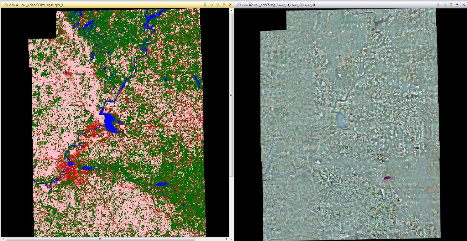
For the first part of this lab exercise I will be creating ground reference points from an aerial image in ERDAS Imagine 2013. I'll use the coded, unsupervised classification image from lab 4, to act as a reference image. Next, I will open the accuracy assessment window under the raster tab. In this window the image from lab 4 is to be opened in the accuracy assessment window. Then I will specify the reference image as the 2005 image provided in this lab (Fig.1). After this has been done, it's time to generate the random points on the reference image which will later be used to determine the accuracy of the classified image produced in lab 4. To do this I will select the option, "add random points utility" which will generate random points throughout the reference image. Then once this is complete I can compare the reference values to the class values within the classified image. 


(Fig. 1) The image which I will be assessing the accuracy of is shown on the left while the image used to classify the reference points in the accuracy process is seen on the right.

When setting the conditions for the random points dialog, I will change the number of points to 125, select the stratified random distribution parameter and set the minimum points to 15. It is also important to highlight the select classes which we we used for land use/land cover classes in previous labs (water, forest, agriculture, urban/built-up and bare soil). Once all this is done it is time to click okay and the random points will be generated (Fig. 2).


(Fig. 2) This image shows the accuracy assessment tool which has generated 125 random ground reference points for the analyst to use to determine the accuracy of the image on the left.

Once the random ground reference points have been created it is time to classify them in order to evaluate them. To do this I will first highlight the first 10 reference points and select the view to show the selected points. By doing this it is easier to find each of the points. Starting with number 1, I will zoom into the point so I can determine the LULC class it belongs to. After I have determined which class it belongs to then I will put the corresponding number to the reference column that goes along with the classes from previous labs (1-water, 2-forest, 3-agriculture, 4-urban/built-up, 5-bare soil). This process will be repeated until all the data points have been classified (Fig. 3).


(Fig. 3) Each of the random ground reference points have been assigned a reference number which corresponds to a LULC class which will be used in the accuracy assessment process.

After that is done, it is time to produce the accuracy report to see how accurate our original image classification was. The accuracy report contains a great deal of information including: error matrix data, overall accuracy, producer's and user's accuracy and the Kappa statistics (Fig. 4).


(Fig. 4) The accuracy report produced after completing the accuracy assessment has a great deal of data.

For the rest of this lab I will conduct the same process in order to compare the accuracy of unsupervised classification and supervised classification in images. In the example above, the image which I am looking at the accuracy of was created by unsupervised image classification so I will conduct the exact same process with an image I produced using supervised image classification. Once the process is complete I can compare the different data found within the accuracy report to determine which method is more accurate. 

Results

After completing two separate accuracy assessments for an unsupervised and a supervised classifications, I was able to determine that the supervised classification method is more accurate. While I did not find the difference to be as obvious as I initially expected there was definitely a difference in the two accuracy assessments. Not only was the overall accuracy greater in the image which had undergone supervised classification compared to the unsupervised, but the user's and producer's accuracy were greater for the LULC classes as well.

In completing this lab I now have the knowledge and skills to assess the accuracy of a land use/land cover classification. With this understanding, I can determine that the images I produced in previous labs are not accurate enough to be used in real world application as both were only about 60% accurate. 

Sources

Data for this laboratory exercise was collected from the following data sources: Earth Resources Observation and Science Center (landsat satellite image), US Geological Survey and United States Department of Agriculture (USDA) National Agriculture Imagery Program (high resolution image). All data was provided by Dr. Cyril Wilson of the University Wisconsin- Eau Claire.